Wednesday, 29 September 2010

Audrey Hepburn to Cheryl Cole Two


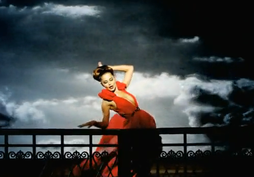
Again more screenshots taken from Cheryl Cole's video 'Promise This' and the fashion and colour resembles Audrey Hepburn's dress from the film 'Funny Face'. 
Both video and film have used blowing wind to capture that beautiful flowing motion from the fine silk-like part of each of the dresses.

Audrey Hepburn to Cheryl Cole


The top image is a screenshot from Funny Face during the singing number 'Think Pink' and while watching Cheryl Cole's newest single 'Promise This' I couldn't help but see the similarities as people pose and jump into the air.
Cheryl Cole in current society has a lot of followers, thoughs who enjoy her music, fashion or as an icon. Whether people like it or not she has become one of the 'IT' girls of the time and for her music video to have close comparisons with one of Audrey Hepburns films gives me confidence that I will be grabbing a younger generation for my Audrey Hepburn themed ride. 

Wednesday, 22 September 2010

Studio Research, Eskimo Creative


Eskimo Creative is based in Manchester and I remember liking some of their work well over a year ago though apparently at this stage in time their website is under development so couldn't really find out much about them. It was hard enough finding their website as I kept stumbling across eskimo designs in Sheffield and London which have no connection with the one I was looking for. Though they did have some of their work on loop while their website is going through construction. I have no idea what each piece is in relation to because of the site at the present moment though I did like these pieces. The top one may have been an idea in development because of the medium it seems to be created in but love the composition in terms of contrasting shapes and use of colour. And the image below has a sort of reference to a fashion shoot because of the inclusion of models and the Adidas graphics in the background.

Studio Research, Young


Young is a design studio based in Manchester. I really took a shining towards this company, it seemed to give off a friendly and appreciative vibe. The company is only just over a year old which also made me warm up to it as they may have a more open mind about specific things and not be stuck up their own arses.

The company was put together by a Gethin Vaughan and a Pete Jarvis, though I had to hunt around for these names as I only came upon them in their past news section claiming an article they were featured in by Computer Arts magazine. They have been mentioned in this magazine a couple of times and are also to be mentioned in a Creative Agency Awards Nomination Book which impressed me considering the young age of the company. Also taking this into consideration I would believe these are the main players within the company and maybe the only two at the moment.

They specialise in many areas such as print design, illustration, logo design and interior and exterior branding. The image I've placed at the top I had to feature in this post as a series were done and they were all hand drawn, a technique I love and know I'm good at which comforts me in a way that a company doesn't leave out the technique of drawing. The other image below I wanted to include to prove the versatility of the company as both images contradict each other. The image was used to re-brand a gallery.

The company is very young and for it to come so far in a year I think they are most proud of that. They have a contract with Penguin books, their work has been featured by HBO and they have also been mentioned in prestigious Art magazines. I think as a bundle this company is proud all around.

Being so young I don't believe they have won any awards as of yet, and had never come across them before.

Studio Research, Love Creative


Love Creative is a design studio based in Manchester. Their website explodes of all the different types of work they produce, though the theme they push upon is the idea of brand activation. In their short video they quote 'Love finds the most interesting things to say about your brands in the most interesting ways.' They have a broad range of work from illustration to moving image to ad campaigns to designs for retail. I love the diversity the company seems to embrace and was one of the studios I failed to get a portfolio visit with last year.

The studio consists of 32 employees. The managing director Chris Conlan is first to be viewed situated at the top of the page among his colleagues which gives the impression he is one of the main players and was also quoted in a newspaper recently on an article about the North West Creative and Digital Industry. Every employee is given a title within the firm which makes me believe there are no connections with freelancers.

The work they seem most proud of because of its exposure throughout the website is the Umbro Ad for trainers, one of them I've shown above. I love the mixture of pop art illustration with photography. The aim they claim was at 'football crazy kids that appreciate the art of fast living' which I think is a very effective and innovative idea. The energy and dynamics of pop art compliment well the themes of being fast and energetic.

No awards that I know of. I did know many pieces of their work beforehand, many that I loved and thought were brilliant ideas which was why I researched them and listed them as one of my top 5 studios I'd like to work at.

Studio Research, Raw Design


Raw Design is another studio based in Manchester. I think one of the main reasons I chose to include Raw in my Studio Research is because of its cute and quirky moving image process page which you'll have to visit just to get the real feel of it rawdesignstudio.co.uk home page then near the bottom 'raw process'. Its a small animation on loop visually describing their process methods, which they believed would separate them from the norm. 

Their work differs from print design to web design to producing work for ad campaigns.

After researching I found their studio consisted of 5 men and 2 women. Full time or part time? this was not mentioned though I got the impression they were a close knit group of designers that did work full-time and there was no mention of a reliance on freelancers.

The work they seemed most proud of was a project titled Christmas by Colour. The project seemed to keep popping up throughout their website and also was a piece that got them into a book 'Book of the Year, Design and Design.Com'. The project was for charity and if you can slightly see the top image each colour has been given a name in relation to christmas e.g a dull green is titled and M&S Christmas a vibrant red, Coca Cola. The piece coming together as a full on poster does look attractive and holds an interesting idea and is actually the piece that made me come and look back at Raw Design as I'd glanced upon their website in the past.

Raw Studio has won three awards for...

Best use of Illustration

Best use of new media

and the third bronze award for best poster: Christmas by Colour


Studio Research, Huvi Design


Huvi Design is a studio based in Manchester. I chose to research Huvi as looking at their website I got a very fun and vibrant feel of the company and its work.

They point out on their website that their work consists of brand identity, printed media, interactive design, web, packaging and illustration, a very diverse collection which I think I would find comfortable.

Touching upon the subject of employees I read that a man named Adam Robson and another named Matt Keers had founded the design company though doesn't mention any other names. This had me questioning that the company may be a private one conducted and managed only by the two men which obviously are the 'main players', and all the work featured on the website had been created only by the two.

From looking on their website it seems they don't favour one project over another. Every project is represented in the form of a square, all the same size and all equally spaced with the newer projects situated at the top of the page so was quite hard to distinguish which they were most proud of. So to conclude I'm going to describe my favourite which is the Nike 78 project. The piece is a moving image piece so is very suitable considering my work. The piece begins with a very luminous graphic-style designed Nike trainer. All these colourful parts of the trainer with leaps of energy explode in all directions representing the beginning of a race. The second image i have uploaded signifies their research of the project placing colourful bits of wire in the trainer for it to twist and turn in any direction once leaving the trainer. The piece delivers a jumpy feel which to me only made the piece feel quirky even though its promoting a commercial item. This project and outcome could possibly be a piece they are most proud of as its very different to other pieces they have created. Looking at other pieces the Nike one seems their only moving image creation so maybe this is an area they want to look more into and create more pieces like it.