Tuesday, 26 January 2010

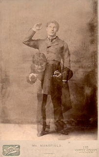
Strange case of Dr Jekyll and Mr Hyde


Dr Jekyll and Mr Hyde is a story of the split personality revolving around the concept of human nature and that there's good and evil in all of us though some of us may try to suppress the evil.

As my idea for the Autumn collection revolves around Halloween I think using the idea of a split personality is scary as it's the idea of unleashing the evil within someone. Though still wanting my window to have a fun aspect I thought of a tagline which read 'the curse of the teddy baker' or just 'the curse of ted baker' being unleashed. This could carry a message about his autumn collection, his new baddest meanest range of clothing creating an edgy aspect to his clothes, the side of Ted Baker you've never seen before.


Friday, 22 January 2010

Masquerade Masks


Another idea I came across for the Ted Baker window display was the idea of masquerade masks. Considering my target audience I thought that around the autumn season they maybe talk of halloween parties and some discussion of fancy dress. To keep the idea representative of my sophisticated audience I thought the idea of masquerade masks gave off a sexy feel as it's a slight disguise of the face though brings attention to the eyes. A not knowing who's behind the mask can be quite sexy too. 

Ideas for Ted Baker Autumn


Researching Autumn is difficult to pull away from the leaves aspect of it all. Though maybe I could create something that relates to leaves though in an abstracted way. I love the image I found above. Close-ups of leaves, autumn like colours though manage to look florescent. The image could be something that's been looked into by a microscope or something acidic, or possibly something seen from hallucination. Hallucinating can be seen as a loss of control so maybe look more into that. To the point of losing control with Ted Baker.

Wednesday, 20 January 2010

Ted Baker Window Displays


After researching Ted Baker across the Internet I came across quite a few of Ted Baker's window displays. There is a consistent trend of 3-D mechanical moving objects promoting new seasons. Along with these came tag lines that related to the different seasons e.g spring is in the hare, revenge of the Christmas trees and Ted's gone Cuckoo!

I think they certainly promote the shop in a light hearted way in not making them seem too much of a serious stuck-up shop as some of the other designer shops may do.

I can't help but wonder though are these mechanical moving objects really appealing to their audience? I watched a fashion show of Ted Baker's on the Internet and the audience mainly consisted of early 20s to late 30s. Are moving rabbits and christmas trees pulling this age gap into the store or is it being mistaken for a toy shop?
 
Watching another clip from the internet a woman was interviewing another on the window displays at Ted Baker. The woman being interviewed in her mid-twenties exclaimed the spring window (rabbits) caught her eye but did not want to make her go in, claiming it wasn't her style.

In conclusion I personally love the window displays though not for the type of shop. I believe I sit in the age gap of Ted Baker's target audience and bouncing rabbits don't really get me in the mood to shop for clothes.


Monday, 18 January 2010

Ja Studio, Ion Ander Beloki, Competition Brief


Ion Ander Beloki designs shop windows for the clothing company 'Loreak Mendian'. I love the unusual concepts he uses for his window designs, I'm certain these displays catch the passers-by attention which is the aim of the 'Ted Baker' brief. The image at the top is my favourite there are no garments/accessories placed in the window though an interesting display of indulating aquatic shapes. I think to pull off a fashion window display without actually placing any garments in it whatsoever is very clever. The visual I think is supposed to represent tropical fish signifying many colours, promoting the spring/summer collection. Then the tagline 'fishing for compliments' is a great play on words, insinuating the idea of the aquatic shapes but also signifying if you wear our spring/summer collection you will be fishing for compliments.

Sunday, 17 January 2010

Tokujin Yoshioka, Competition brief


As our new brief of competition commences, I had been looking at YCN's annual collection of live creative briefs. As a main interest of mine is fashion I was immensely pleased to find a 'Ted Baker' brief. The brief consists of making use of it's shop windows as the primary vehicle which in fact got me excited as in the past I had thought of shop window design in the past as a possible job prospect for myself. Though now I have to create a mixture of the two; shop window design and moving image.

Beginning my research I came across Tokujin Yoshioka, a designer that secialises in the elements of space design, product design and shop design. The last one obviously catching my attention. Above are examples of his work.

The image portrayed at the very top is a video installation. The woman in the video acts as if she is blowing. The scarf however is real and moves and flows in great timing as if the woman in the video is making it move. It is such a simple idea though looks very effective and would certainly catch the eye of the consumer.
The Swarovski shop design is created with stainless steel and is intended to resemble a crystal-like forest which I think is beautiful. This I thought gave great connection with the H. Samuel brief, another I was looking at as the retail space is to be considered within the brief.